The Easy Guide to Building AI Dashboards
Introduction: Turning Numbers into a Story
Let’s be real: looking at a giant spreadsheet full of numbers is boring and confusing. It’s hard for us to see what’s actually happening in our business when the information is buried in thousands of little boxes.
But here’s the good news—we don’t have to do the hard work ourselves anymore. Using new AI tools (like Gemini 3 or Claude 4.6), we can turn those messy files into colorful, easy-to-read dashboards in less than two minutes. This helps us stop guessing and start making smart moves.
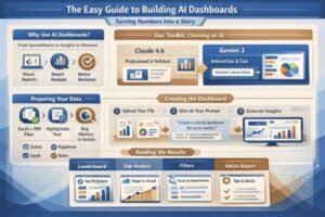
Our Toolkit: Which AI Should We Use?
Choosing an AI is like choosing a bike—it depends on where we want to go. Since it’s 2026, we have some amazing options:
-
Claude 4.6 (Professional & Polished): If we want our charts to look like they were made by a high-paid designer for a big meeting, Claude is our go-to. Its new “Data Plugins” make sure the math is perfect.
-
Gemini 3 (Interactive & Fun): If we want to “play” with our data, Gemini is the best. It has a feature called Canvas that lets us click on different parts of the chart to see more details. It’s like turning our data into a mini-app.
Important Note: When using Gemini, look for the “Canvas” button near the bottom. If we don’t click that, we’re just getting a picture; with it, we get a tool we can actually use.
Preparing the “Food” for the AI
AI is smart, but it’s not a mind reader. To get a great dashboard, we need to give it clean data.
-
The Format: We should use Excel files or PDFs.
-
The Quality: Make sure the text in our PDF can be highlighted. If we can’t “select” the text with our mouse, the AI will have a hard time “reading” it.
What should we include?
-
Scores: How is the team doing?
-
Happiness: Are people enjoying their work?
-
Goals: Are we making as much money as we planned?
-
Rules: Is everyone following the standard procedures?
How to Talk to the AI (The Prompt)
If we give a boring instruction, we get a boring result. We need to tell the AI who the dashboard is for.
Try saying this:
“Here is a file about our team’s work. Create a colorful dashboard for us to review. Tell us what we are doing well and what we need to fix immediately.”
By saying “for us to review,” the AI knows to keep things simple and focus on the big decisions.
Reading the Dashboard
Once the AI builds it, we don’t just look at the colors. We look for:
-
The Leaderboard: Who are our superstars? Who needs a little extra help?
-
The Gap: A chart that shows the difference between where we are and where we want to be.
-
The Filters: If we are using Gemini, we can click on one specific department to see only their numbers.
The Best Part: The “Advice” Report
The coolest thing about 2026 AI is that it doesn’t just give us charts; it gives us advice. It will tell us:
-
The Wins: “Hey, your sales team is doing amazing this month! Keep doing what you’re doing.”
-
The Red Flags: “Warning! Your shipping costs are way too high. You should look into this today.”
We can even ask the AI to turn this whole thing into a PDF or a slideshow so we can show it to others.
Conclusion
We don’t need to be math experts or computer geniuses anymore. As long as we have the data and a clear goal, AI can do the heavy lifting for us. In just two minutes, we can turn a boring file into a clear map for success.
Thanks to KL Forward You Tube Channel
Visit AILIFEGURU for more posts like this